
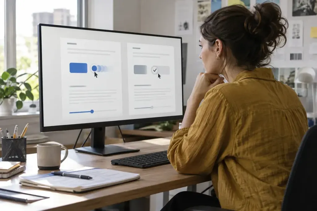
A page can respond to a click without sliding half the screen across the viewport. For visitors who request less motion, the useful information is often the new state, not the journey the interface takes to reach it.
The prefers-reduced-motion media feature lets CSS detect the user’s expressed preference. MDN describes it as a way to remove, reduce or replace non-essential motion. It is a preference to respect across the experience, not a reason to hide feedback.
Decide what the animation communicates
Separate decoration from information. A background parallax effect may add atmosphere but no essential meaning. An expanding error panel communicates that something needs attention. The first can often disappear; the second still needs a visible, accessible state change.
@media (prefers-reduced-motion: reduce) {
  .decorative-pan { animation: none; }
  .result-panel { transition: none; }
}
This small example targets known components. It is not a complete accessibility solution. Review JavaScript-driven motion, embedded media and interactions as well as CSS.
Test the task, not only the setting
Enable the preference on a test device, then submit a form, open navigation, reveal an error and wait for a long request. Confirm that the result remains obvious and keyboard focus still moves appropriately where needed.
Do not rely on an animation finishing to perform essential application logic. Removing or shortening motion should not prevent a button from becoming available or a status message from appearing.
A static label such as “Uploading” with a meaningful progress indicator can preserve information without unnecessary movement. Check that completion and failure are announced through the appropriate accessible mechanism.
Document the reduced-motion behaviour beside the component’s ordinary states. That makes future design changes easier to review and prevents the preference from working on the homepage while being forgotten in the checkout or account area.